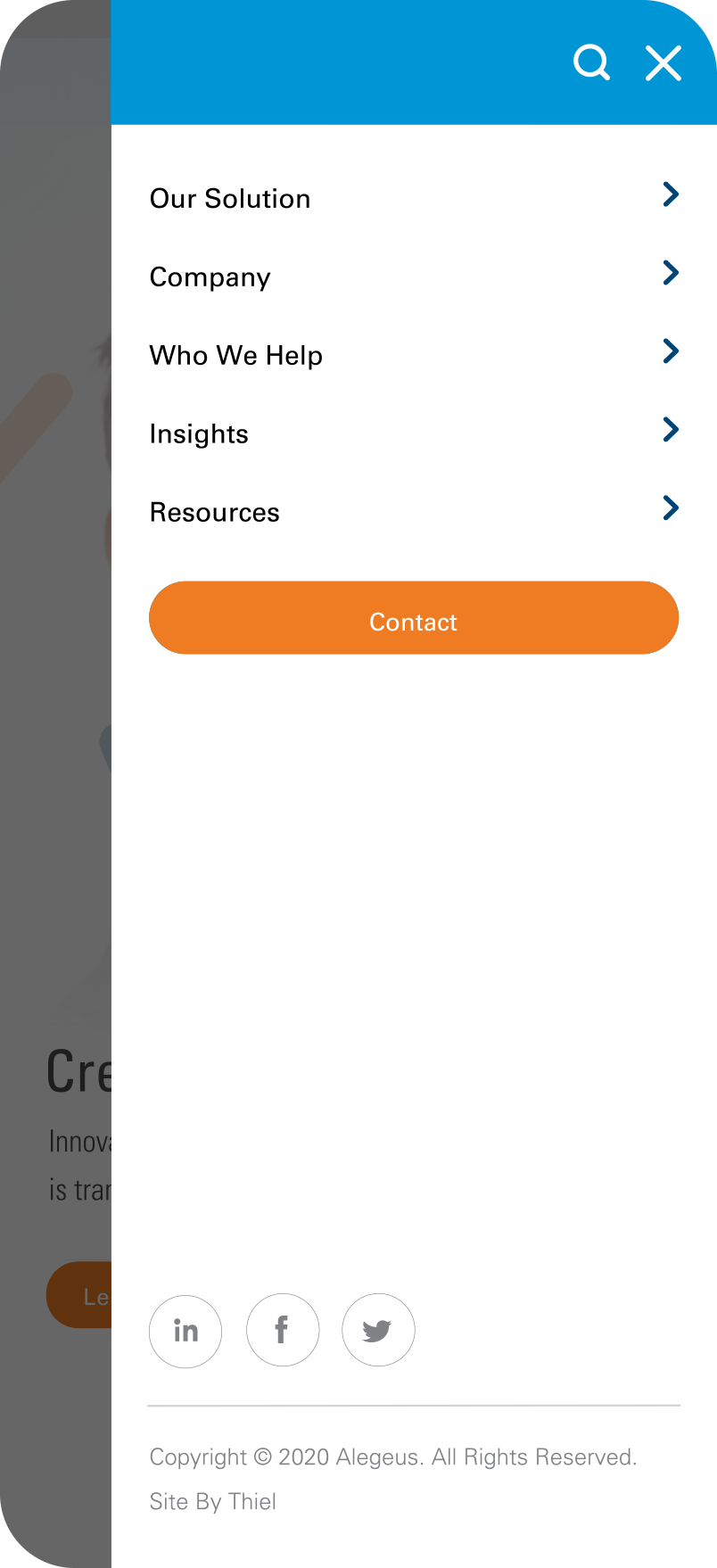
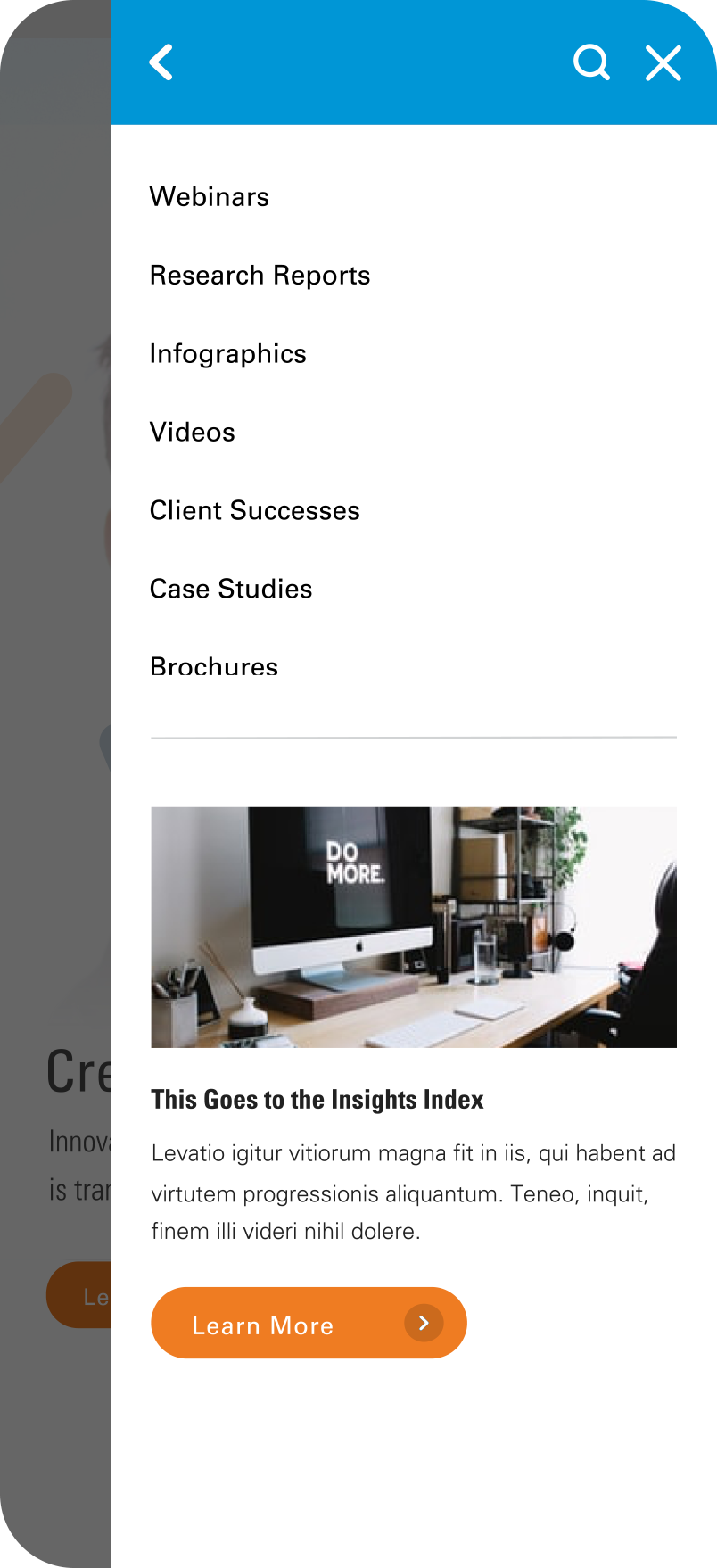
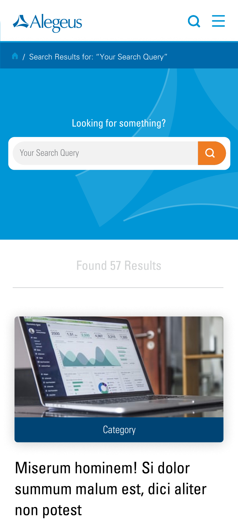
The wireframing process occurred in two phases: Low-Fidelity involved creating page template content blocks, while High-Fidelity focused on developing detailed interfaces for each core page. Through internal team meetings and client-side presentations, feedback was gathered to enhance the wireframes, creating an official blueprint for the entire site build. Navigation and Insight/Media filtering were streamlined for a more user-friendly experience, transitioning from lists to a series of select box prompts as needed.
Alegeus.
Role
-- Art Direction
- Prototyping
- UI /UX Design
- Wireframes
AGENCY - THIEL Brand Design
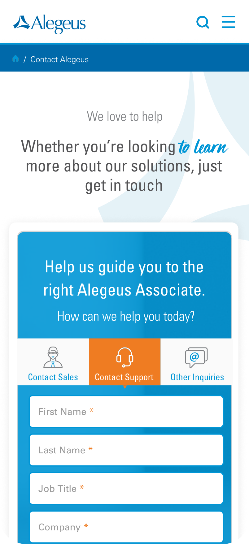
Alegeus, known for its digital white-label health care benefits platform, aimed to revamp its website to reflect its updated brand identity. The challenges included adapting to evolving brand standards, emphasizing the need for a strategic approach to wireframes and early prototypes to ensure UI/UX readiness amidst brand guideline changes. A pivotal goal for Alegeus was to establish itself as a thought leadership hub, driving the creation of versatile templates strategically housing Thought Leadership Insights.
Blueprinting the
Web Experience.
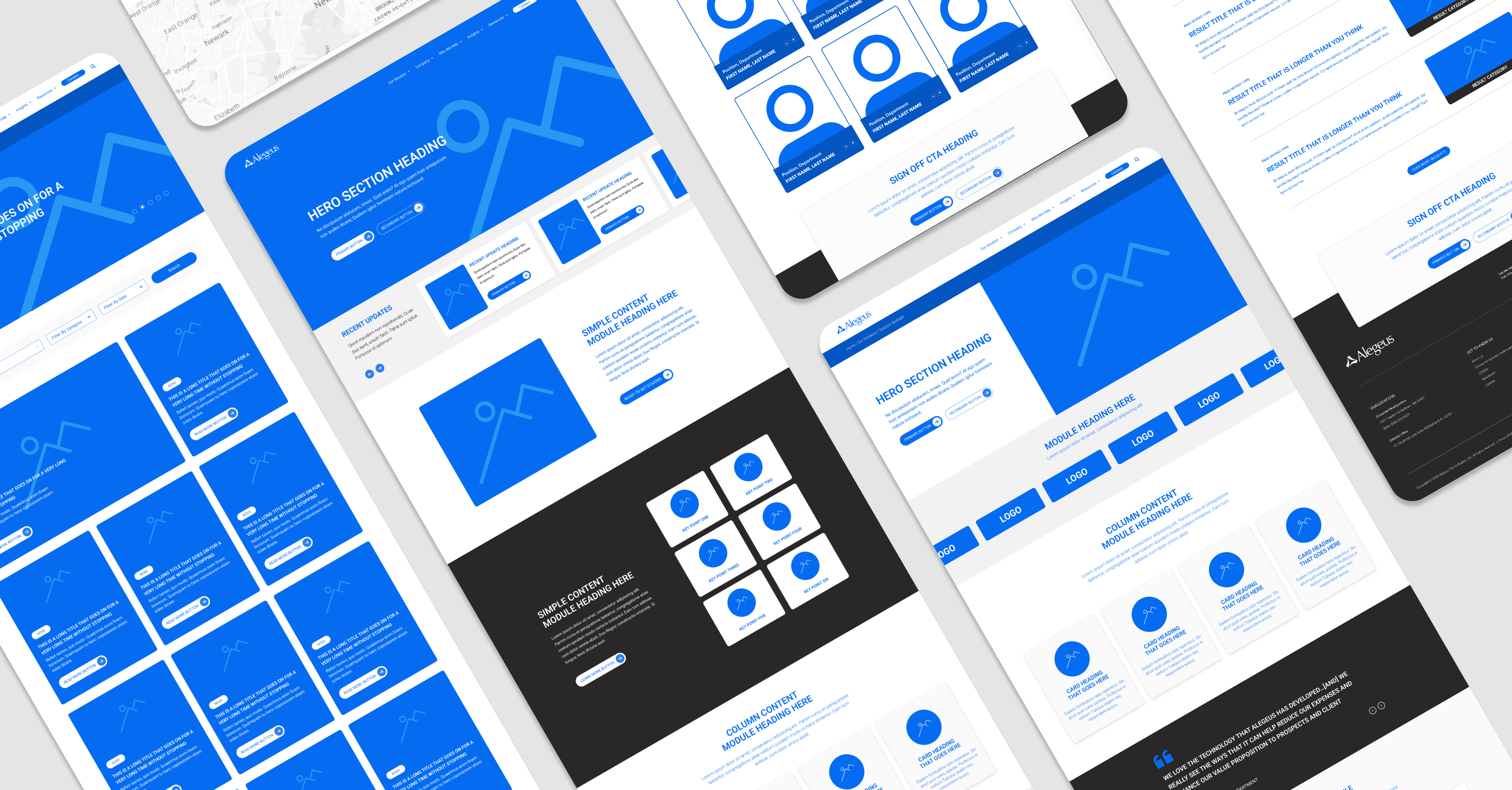
Prototyping emerged as a vital tool, serving as a preview of the user's path through the site. Transitioning from the static layouts of the wireframes to an interactive prototype enabled me, as the designer, to understand how the website should feel to navigate and explore before the brand aesthetics were applied.
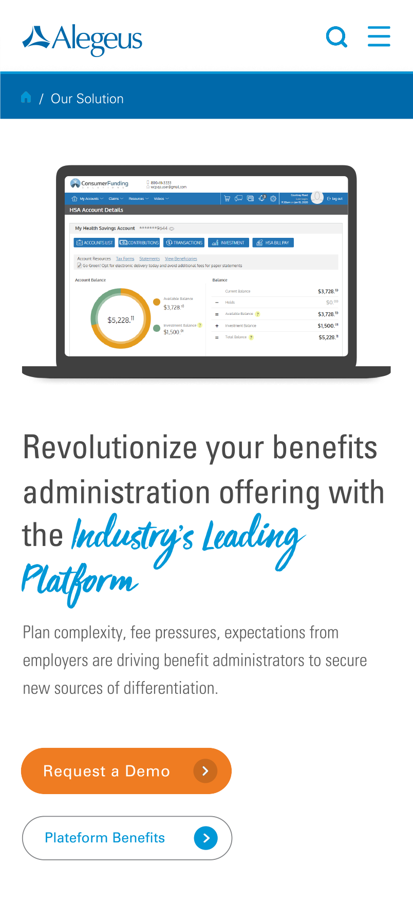
Integrating The Brand's Look & Feel.
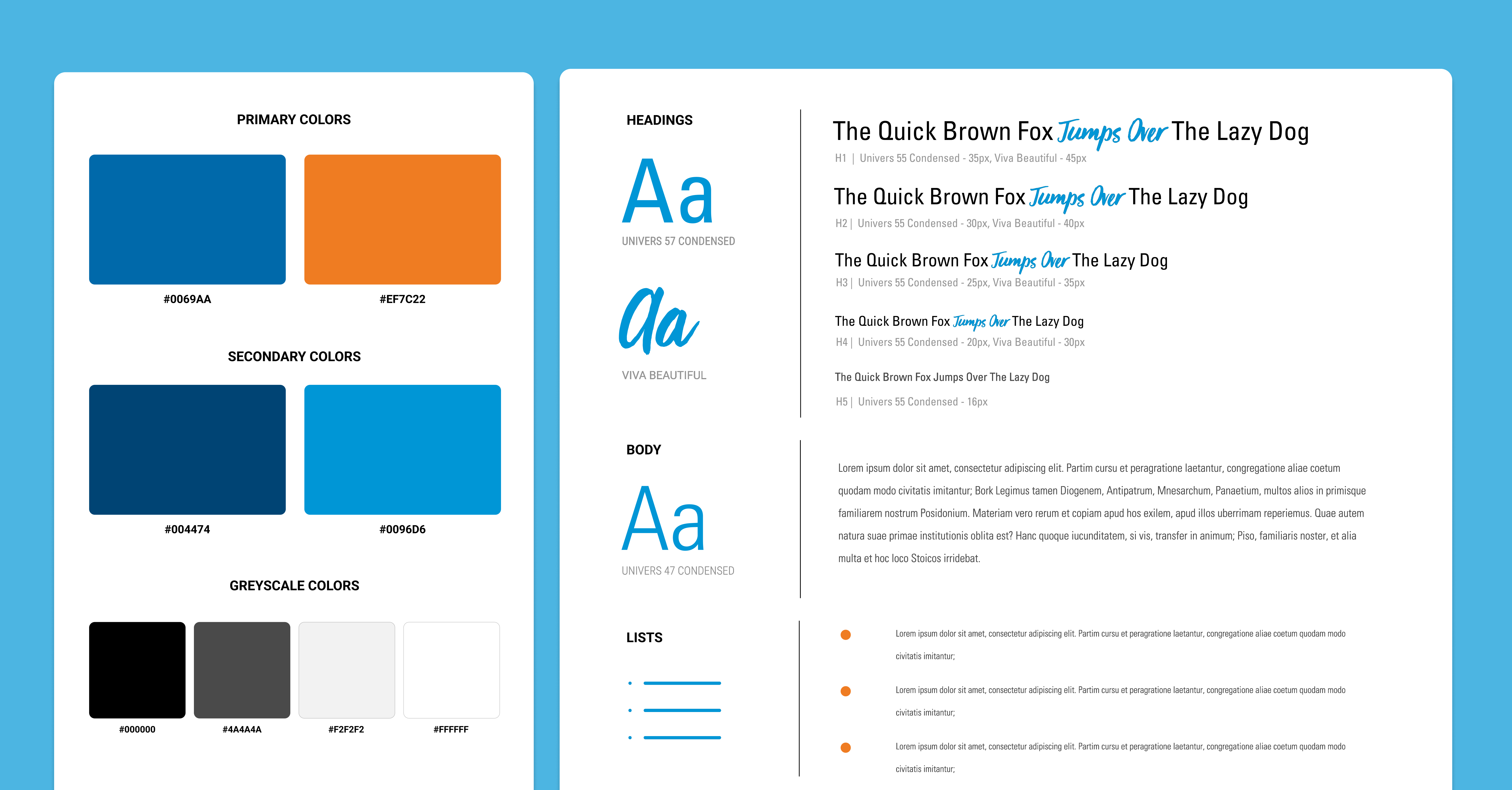
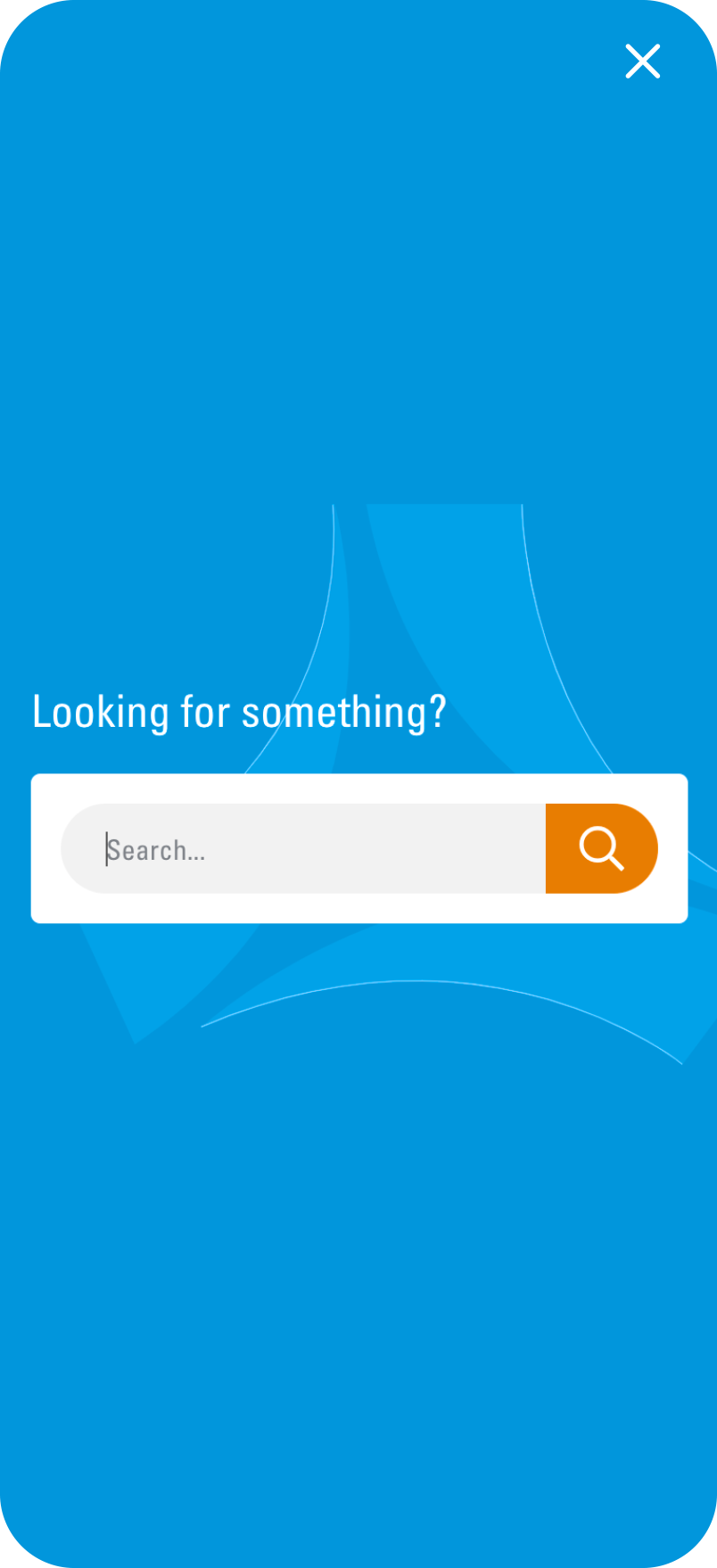
During the website redesign, Alegeus' brand standards were refined by their internal design team, and THIEL collaborated with them through weekly check-ins. The updated color palette reached me as I was finalizing the early prototype of the site. Upon receiving the updated brand standards, I worked to establish a balance between the primary blues for tone and employed the use of the secondary orange to serve as an emphasis tool, highlighting buttons and CTAs.
The Alegeus brand promotes a calming fun experience with a product that is easy to use. Their Type standards promoted the use of various weights of “Univers Condensed” for ease of legibility and the use of the exciting script font “Viva the Beautiful” for emphasis and narrative beats throughout the site.
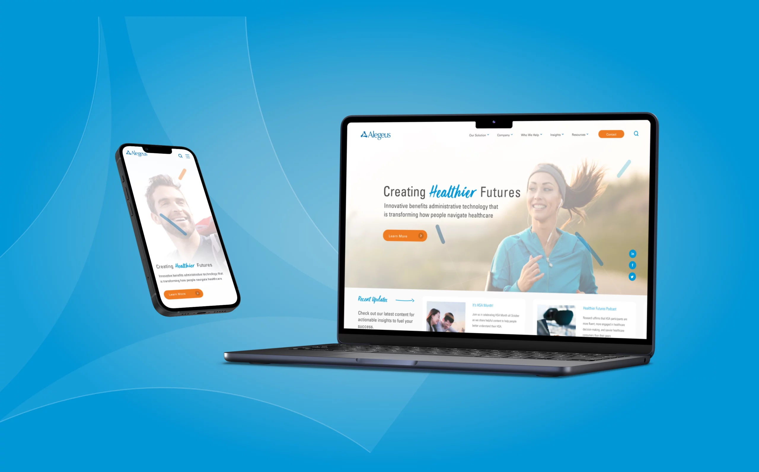
An Insightful New Web Presence.
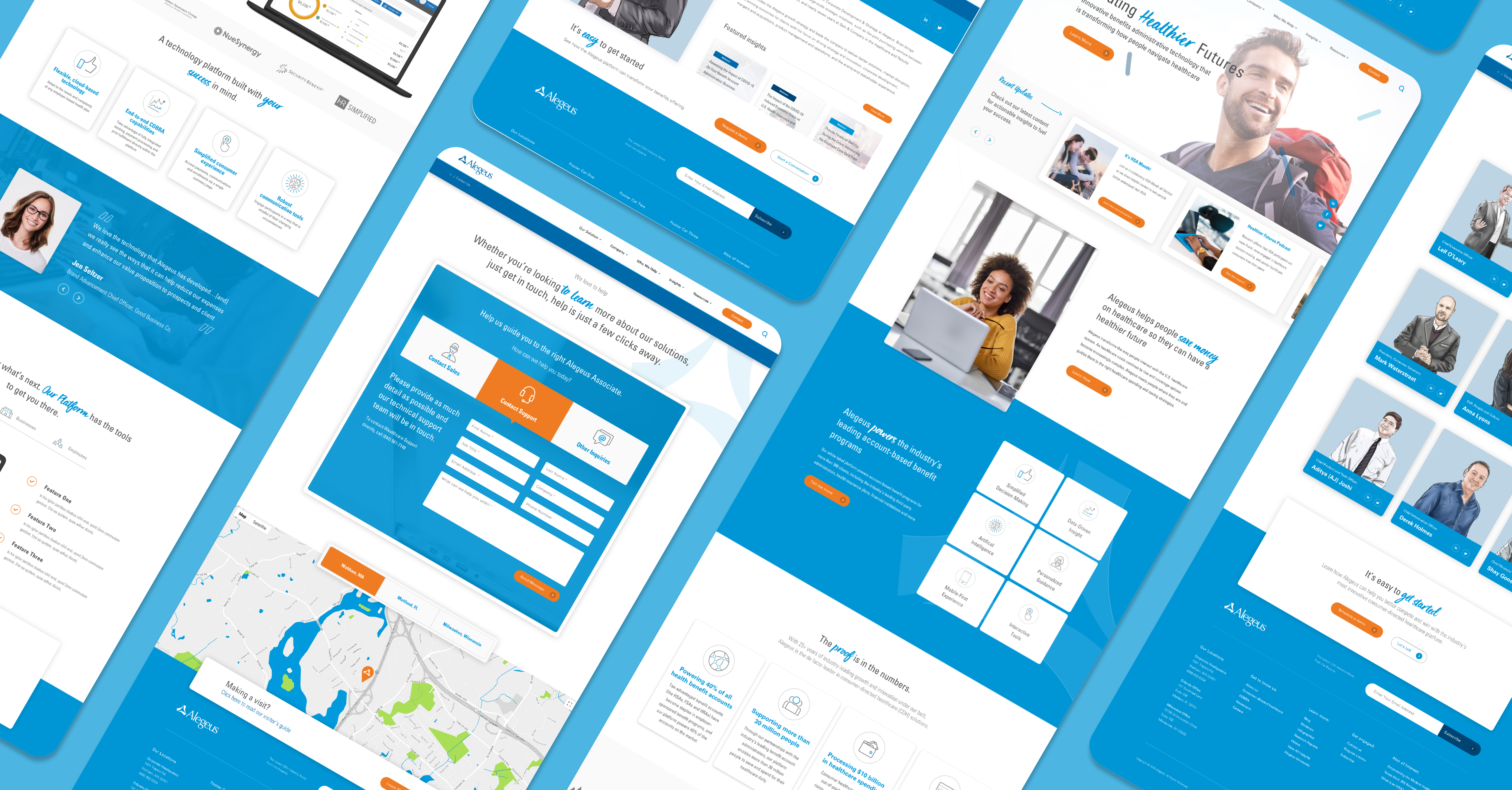
Templates and content modules were meticulously crafted for practicality and brand consistency. Custom-designed templates enabled the creation of tailored pages. Flexible content modules simplified post-launch page building—a highly requested feature by the Alegeus marketing team. In this phase, a significant emphasis was placed on injecting the brand's personality through prominent typography and engaging imagery.
Key elements, such as Thought Leadership and Media index and post templates, underwent rigorous testing and refinement to serve as optimal resources for the returning customer base seeking insights into leveraging the Alegeus platform for individual and company benefit.


Commitment to accessibility across devices remained unwavering. Following a mobile-first approach, my mission was to ensure a seamless experience on any platform, emphasizing user-friendliness while maintaining a premium experience across all device types.