PDC Facilities.

Role

  -  
  • Product Design
  • Prototyping
  • Strategy
  • UI /UX Design
  • Visual Design

AGENCY - THIEL Brand Design

PDC Facilities has pioneered MRI suite solutions since 1982, beginning with shielding many of the first MRI suites to speed this exciting new technology to patients. Their Caring Suite™ system transforms the MRI experience with HD ceiling video displays, personalized lighting, and custom themes turning an intimidating medical procedure into something calming and patient-centered. THIEL was brought on to design version 3.0 of the Caring Suite™ App. I was tasked with creating distinct interface experiences for three user types: patients seeking comfort and control, technicians running procedures efficiently, and admins managing system diagnostics.

Three users, one seamless experience.

Before the procedure begins, patients choose from preset themes i.e. beaches, forests, cabins. Then they personalize further: adjust the lighting colors, change the soundscape, make the room their own. Preferences save automatically for return visits.

Admins see everything. Access to high level patient and technician functions, plus system diagnostics, power controls, and device setup for debugging and maintenance.

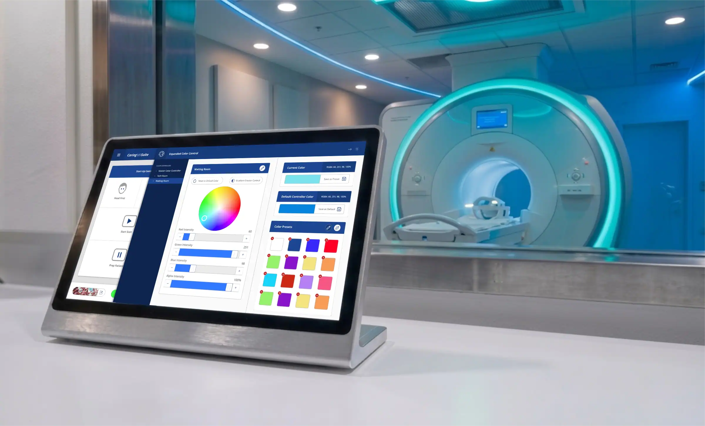
Technicians run the MRI procedure through the same app. They control room aesthetics, send messages to patients via the ceiling display, and pin custom controls to their home screen for quick access to frequently-used tasks.

MAPPING THE JOURNEY

Before any screen could be designed, I needed to understand exactly how each user would move through their tasks. Working in collaboration with PDC's engineering team, I sought to understand the three user types and mapped out how they would move through their tasks. For Patients, Technicians, and Admins alike, I built detailed flow diagrams covering every decision point, from initial entry to final outcome. These flows traced branching paths like choosing a preset theme versus customizing colors, adjusting room settings versus saving them for future visits, and navigating between quick tasks versus deeper system controls.

Build the foundation.

Early explorations started with mid-fidelity wireframes to establish the core information architecture. I mapped out user flows for each persona, identifying critical touchpoints and decision moments. These wireframes helped us validate the three-tiered permission structure and test navigation patterns before investing in visual design.

Crafted for care.

To maintain consistency across all three user views, I developed a comprehensive design system with reusable components, standardized spacing, and a clear visual hierarchy. The system prioritized large touch targets for medical gloves, high-contrast text for clinical environments, and calming colors that wouldn’t add stress to an already anxious patient experience.

Bringing it all together.

The final interface brings all elements together clean, intuitive, and purpose-built for the medical environment. Every screen was tested for usability, ensuring technicians could work efficiently under pressure, patients felt empowered rather than overwhelmed, and admins had the diagnostic depth they needed. The result is an interface that feels natural to use, regardless of which role you’re in.