During the wireframing phase, I laid the groundwork for custom templates and navigation. I transitioned from simple text-based Low-Fidelity Wireframes, blocking out core features and functionalities of the discussed custom template during presentations to stakeholders. Eventually, these were refined into High-Fidelity Wireframes, serving as the core blueprints of the site as it progressed into the Prototyping and Design phases.
Johnsonville.
Role
-- Art Direction
- Frontend Development
- Look & Feel
- Prototyping
- UI /UX Design
AGENCY - THIEL Brand Design
Johnsonville chose THIEL Brand Design for a comprehensive website transformation, where I led the project as the UI/UX Designer, overseeing Art Direction, Wireframes, Prototyping, and final visual Design with occasional Frontend Development assistance. The mission was to seamlessly blend nostalgia with modern design, enhancing the website experience and increasing value for returning users through expanded templates and refined search capabilities.
Experimentation,
Ideation, & Iteration
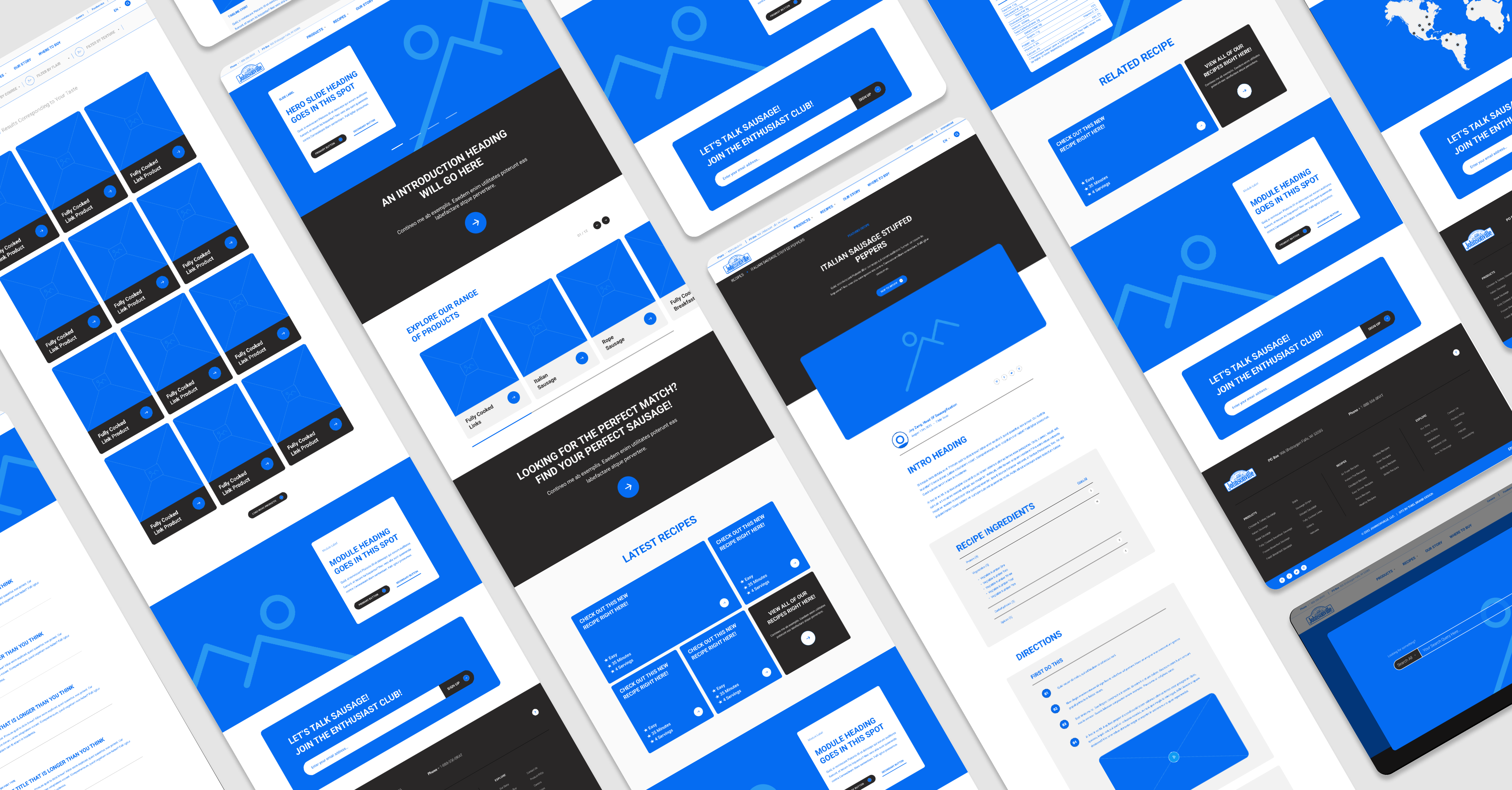
Bringing the High-Fidelity Wireframes to life, I developed interactive prototypes that facilitated thorough review, testing, and refinement of the user journeys. These prototypes went through additional rounds of stakeholder presentations, followed by further testing and refinement. This process culminated in finalizing the interface structure and experience before transitioning into the visual design phase.
Building Aesthetics
into Structure.
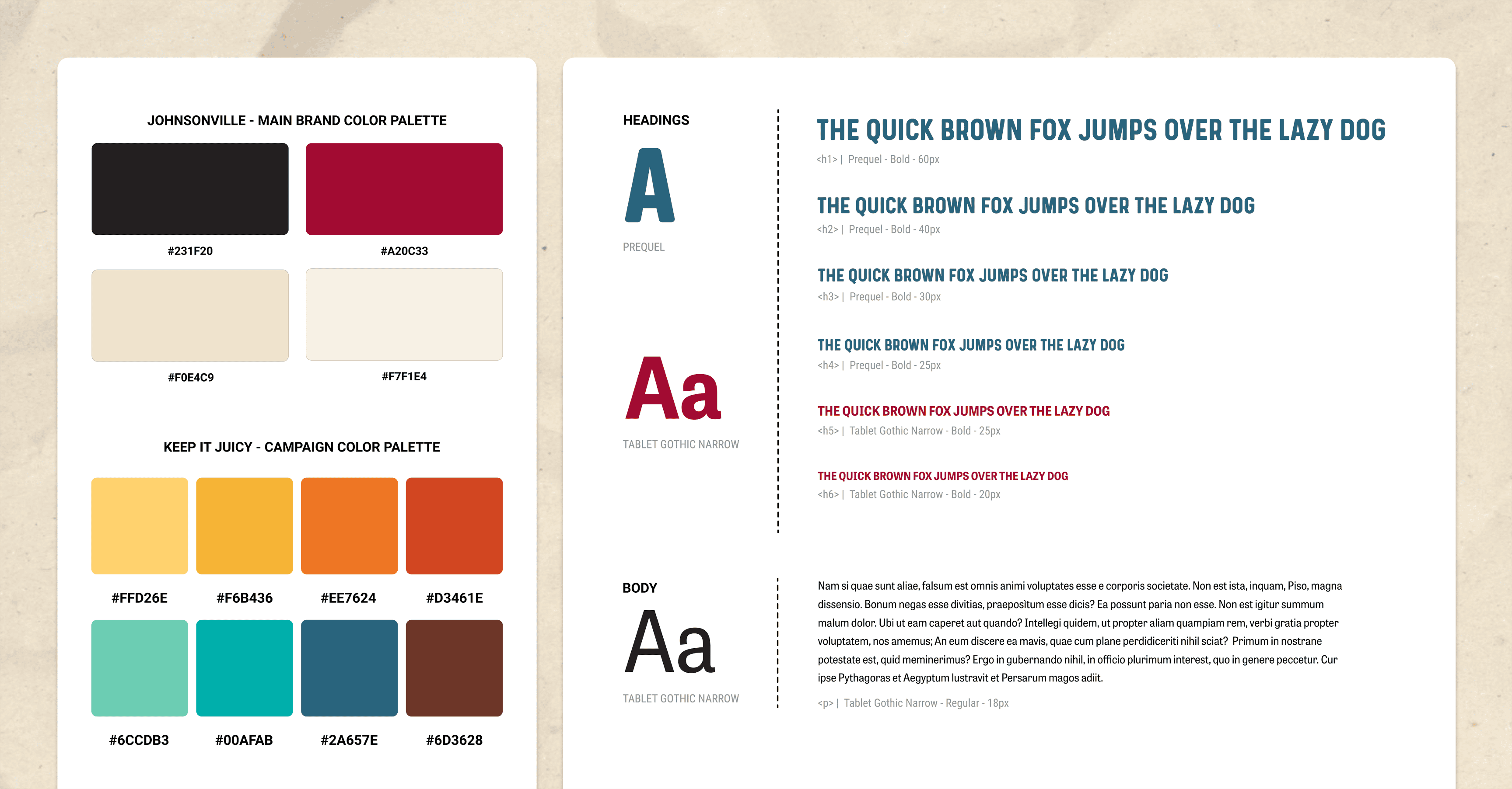
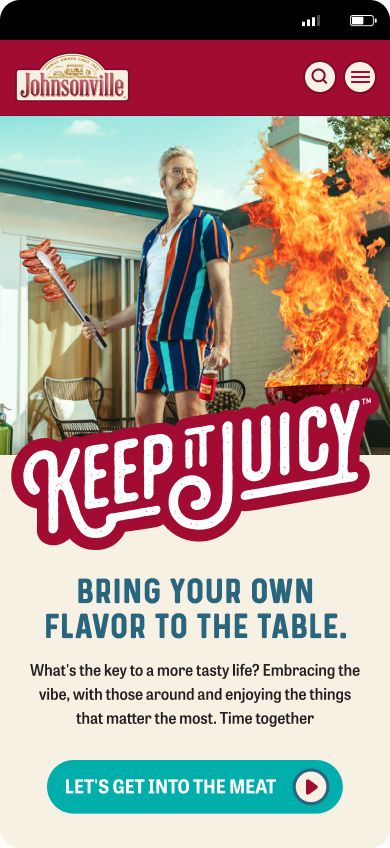
Leveraging the existing brand guidelines, I curated a web style guide, infusing the iconic Johnsonville palette with a modern touch while ensuring ADA-compliant readability. The classic Johnsonville Reds, Blacks, and Beige are. combined with a new marketing rebrand palette centered around a laid-back and fun "Keep it Juicy" aesthetic off vibrant colors, introducing a new visual language both rooted in Johnsonville's classic brand and new marketing campaign.
In collaboration with Johnsonville's internal creative team, we carefully chose the typefaces "Prequel" and "Tablet Gothic Narrow" for the primary heading and body families. Incorporating a typographic hierarchical system into the style guide proved to be a valuable tool for active development, assisting Johnsonville's internal creative team in expanding their new digital ecosystem. Simultaneously, it served as a resource for THIEL’s Development team to establish the frontend development scaffolding.
A Timeless Company,
A New Experience.
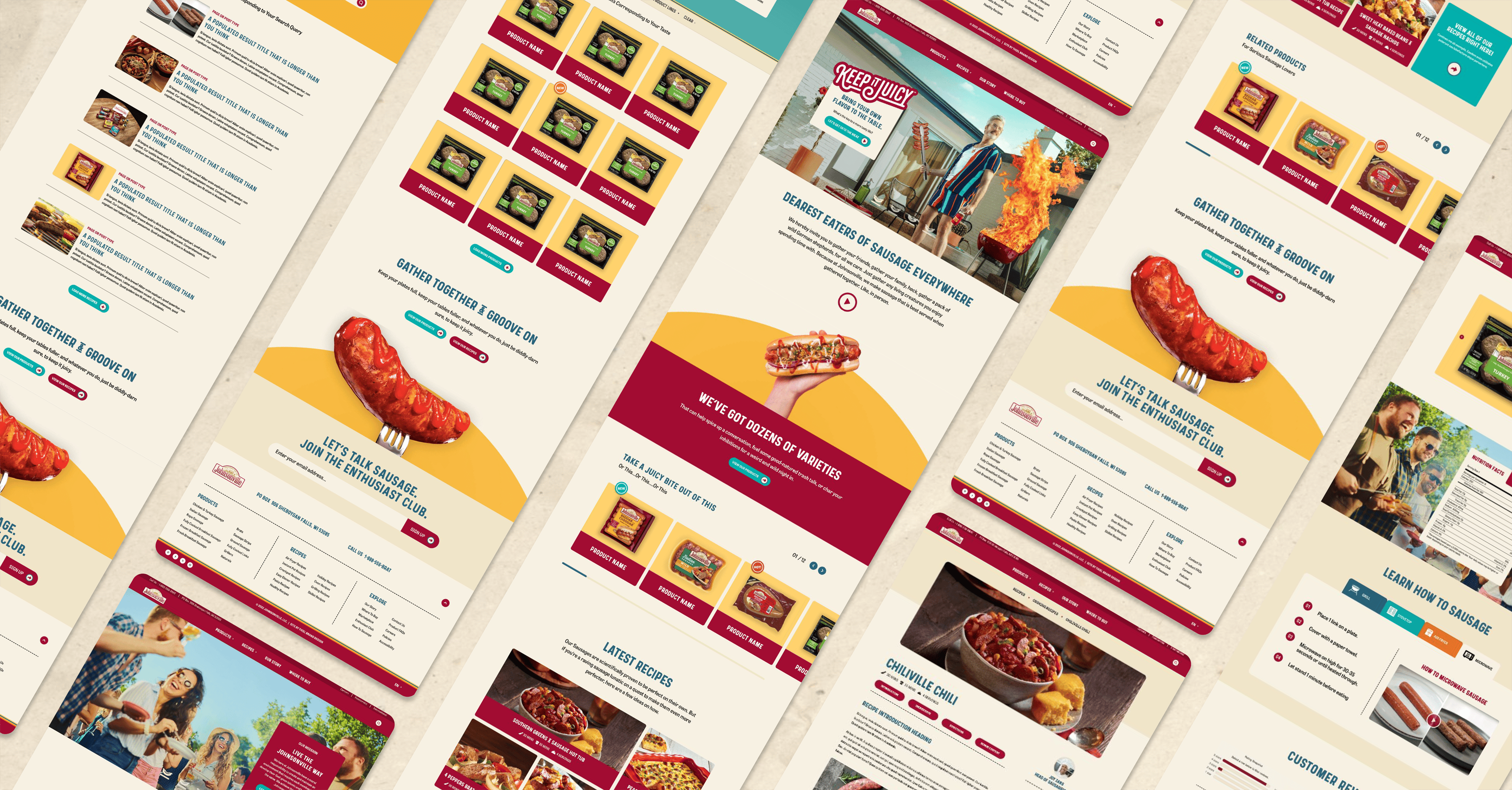
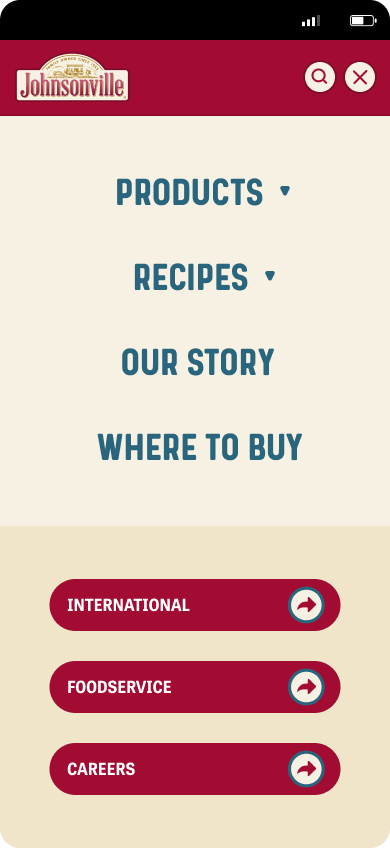
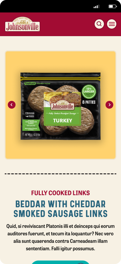
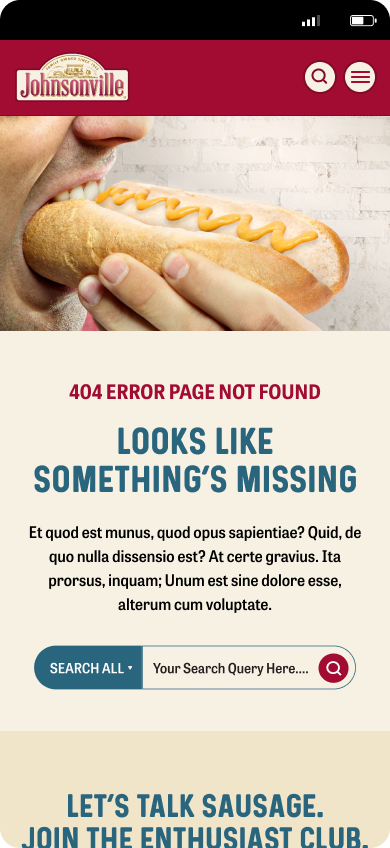
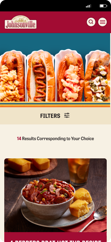
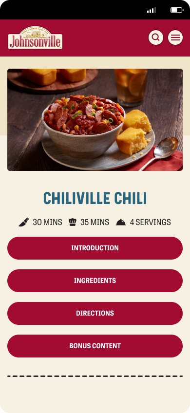
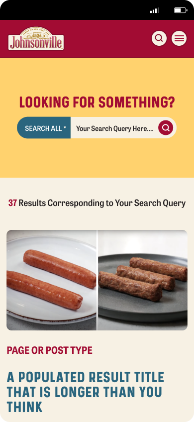
Leveraging the style guide, design system, and high-fidelity wireframes, I developed custom templates tailored to meet specific user needs, with a particular emphasis on Recipes, Products, and the corresponding Category Index Template. This approach consistently added value for returning users. My primary objectives revolved around prioritizing practicality and user-centric design. To accommodate future site expansions post-launch, a suite of modular page interface blocks was implemented. These blocks offer flexibility for diverse options in color, type, and layout, ensuring a cohesive and adaptable design. This system empowers Johnsonville’s marketing team to create supplemental pages for promotions and consumer brand development through the CMS.

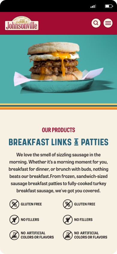
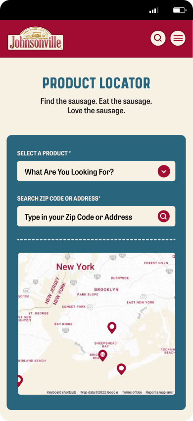
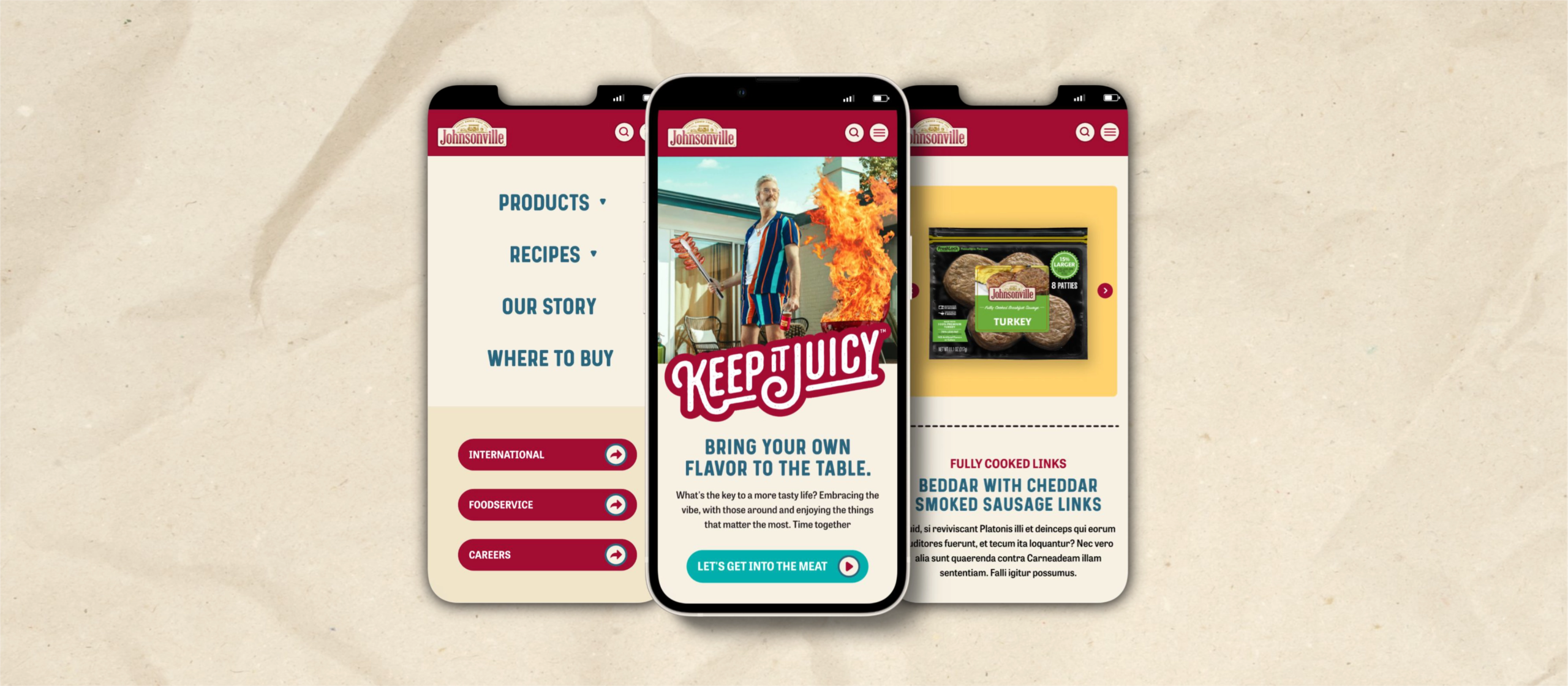
From the initial wireframes to the final visual design and experience, prioritizing a mobile-first responsive design was crucial. This ensured seamless adaptation and user understanding across various devices. My goal was to deliver a user-friendly experience tailored to Johnsonville's diverse audience, extending the brand's charm with consistency and accessibility. This approach serves as a testament to Johnsonville’s core value of inclusivity and THIEL’s mission to deliver a quality product for every user.