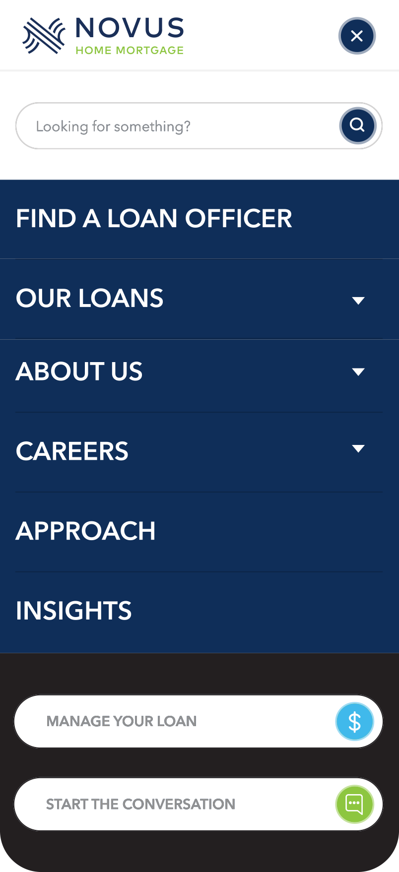
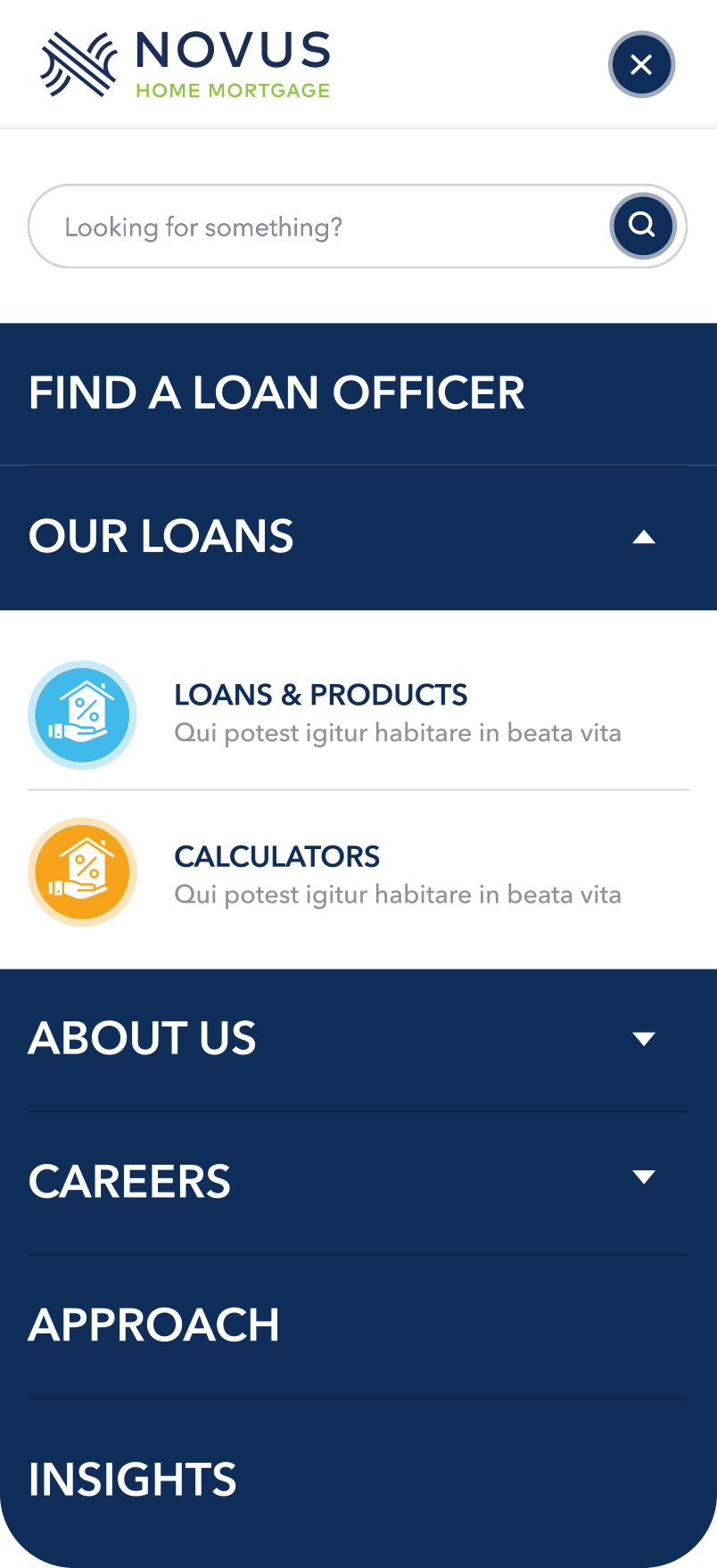
The creation and refinement of wireframes played a vital role in establishing user pathways for both the main company and individual loan officer sides. Key focal points included guiding users through educational paths and lead generation paths. Approaching the wireframes with these paths in mind allowed me to develop a clear core structure for the website. Furthermore, I dedicated attention to sculpting global elements, such as main navigation components, to ensure consistency between the main Novus website and individual Loan Officer sites.
Novus Home Mortgage.
Role
-- Prototyping
- UI /UX Design
- Wireframes
AGENCY - THIEL Brand Design
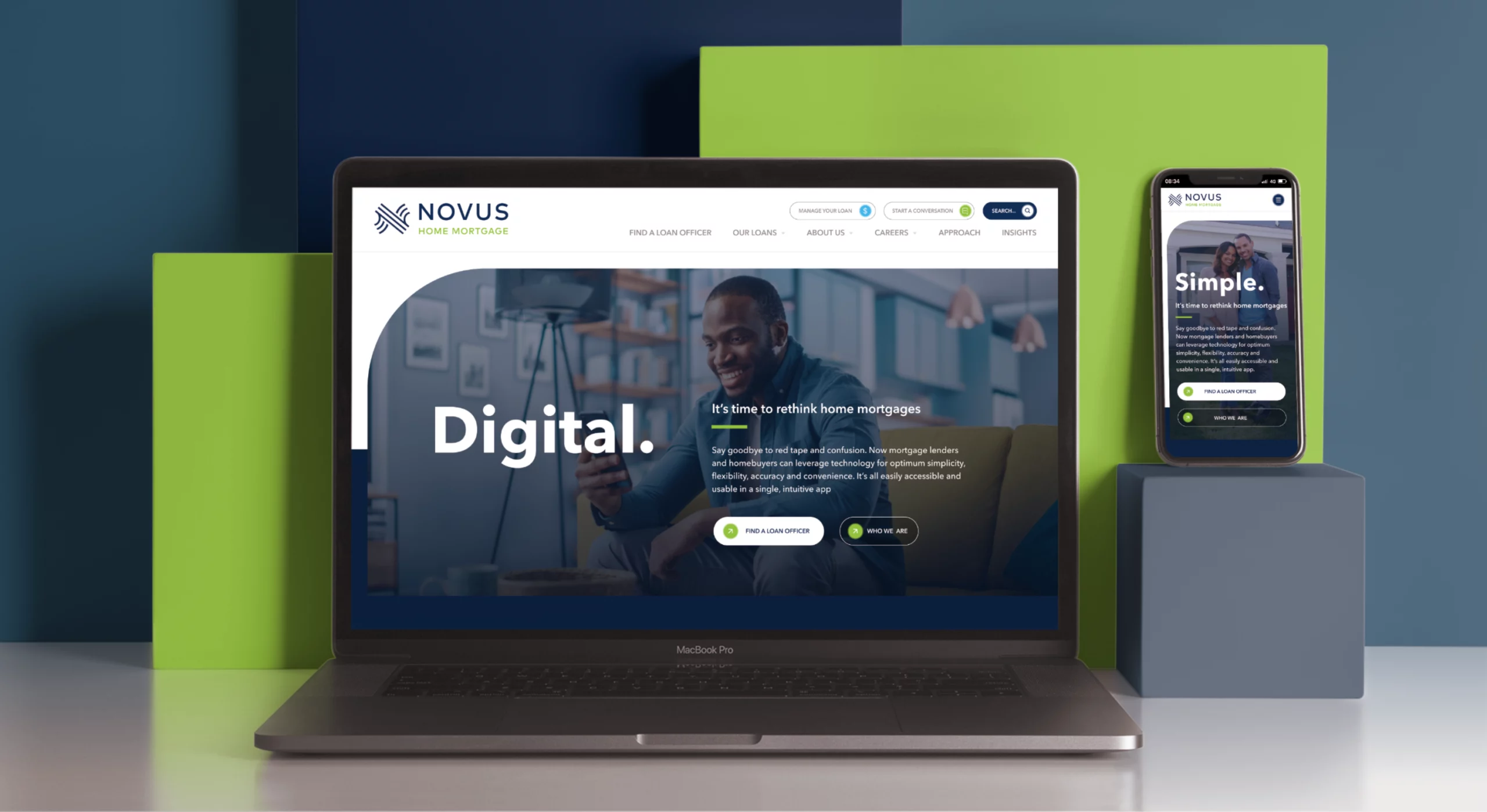
Novus Home Mortgage, a major mortgage player, desired a significant digital transformation for a unified visual identity. My role as lead UI/UX Designer included crafting Wireframes, Prototypes, and Visual Design for the main site, along with a foundational Design System for micro-sites. The goal: deliver an intuitive, visually appealing web experience aligned with Novus's values. This case study delves into Novus Home Mortgage's objectives, my approach, and collaborative efforts for a unified online presence, setting the stage for a broader ecosystem.
Sculpting The
Digital Experience.
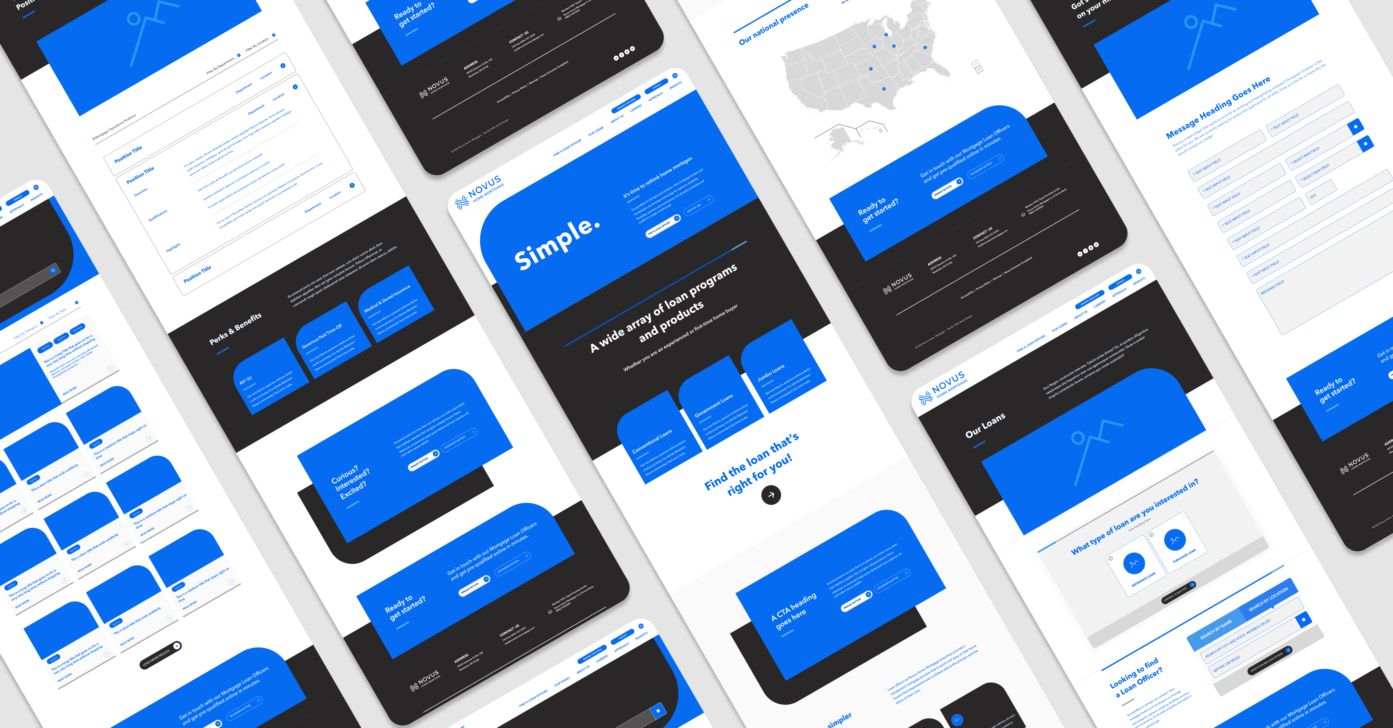
Advancing from wireframes to prototypes breathed life into these initial concepts. Internal reviews with the THIEL interactive team, along with insights and feedback gathered during client stakeholder presentations, played a crucial role in shaping the core user experience. This process also contributed to defining how visitors would navigate the site and how Novus envisioned individual loan officer sites adapting their structures based on the prototypes' baselines.
Forging an
Aesthetic Guideline.
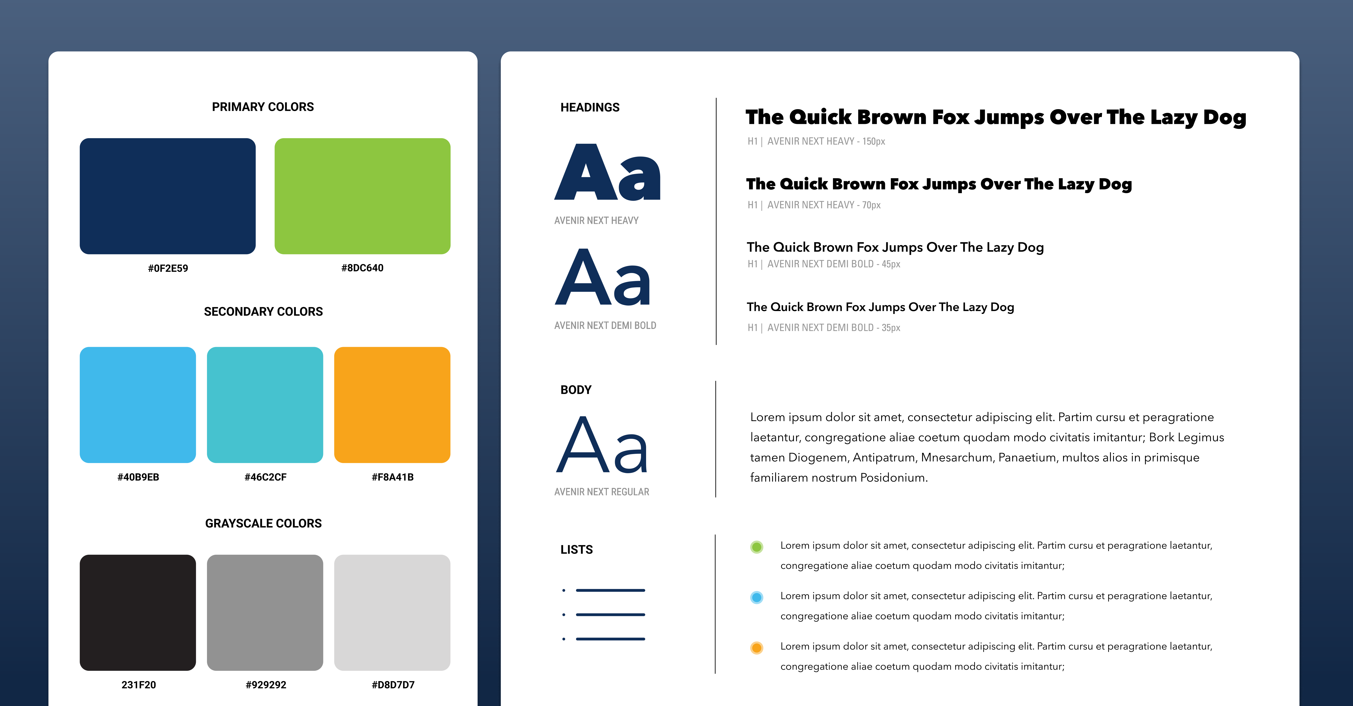
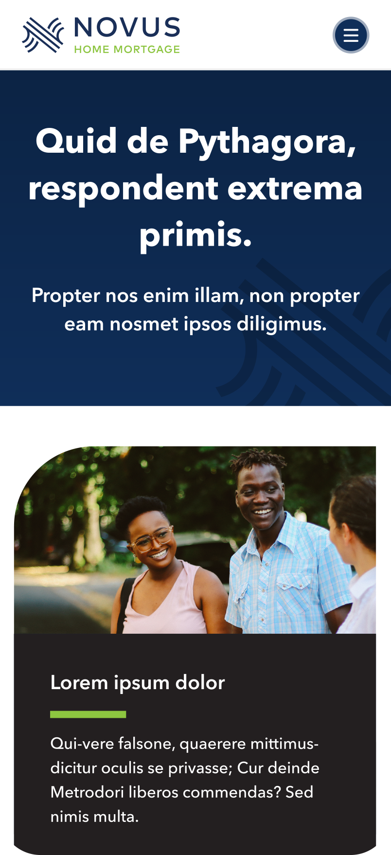
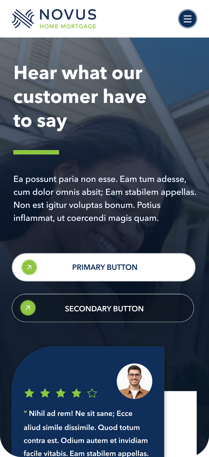
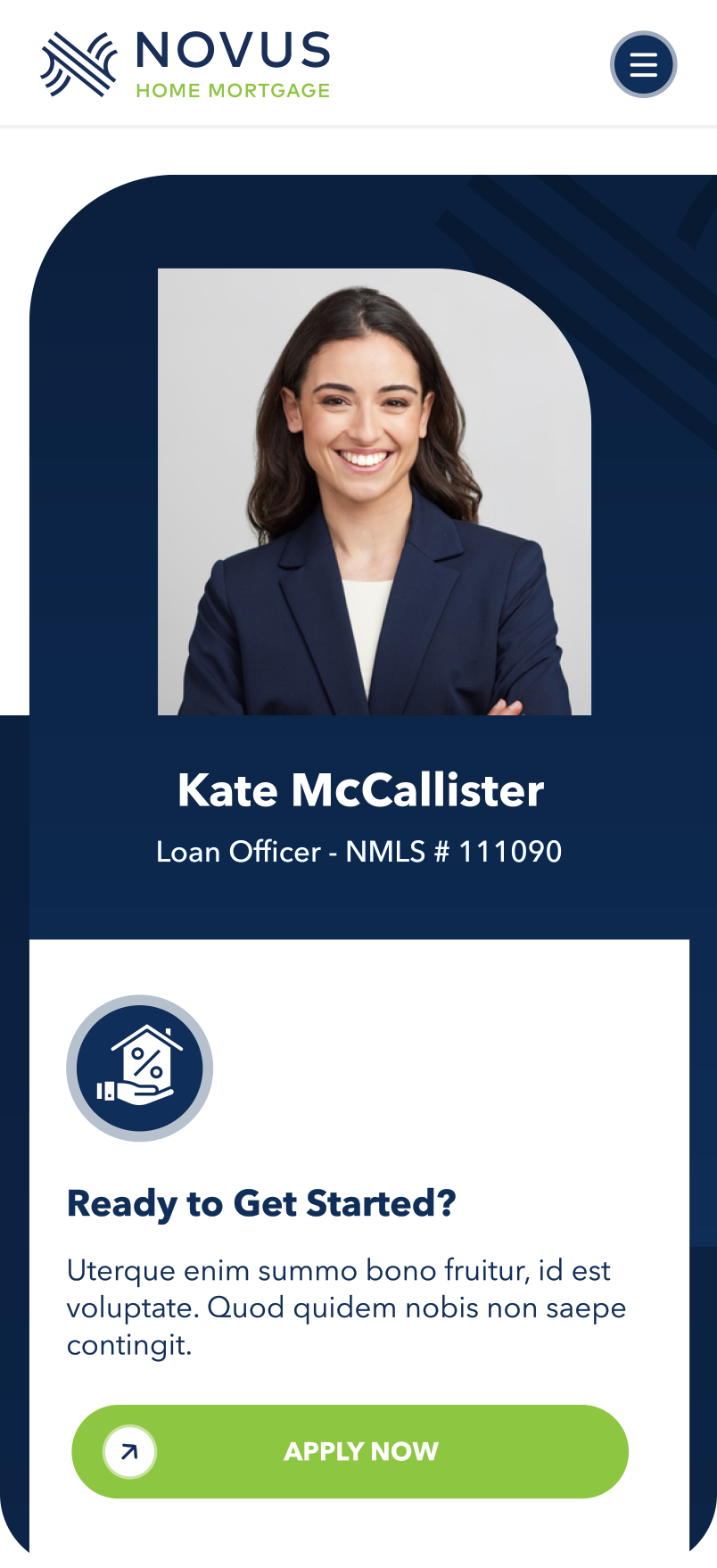
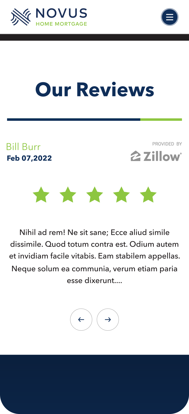
Novus's color palette showcased a vibrant selection of hues. Leveraging this palette, I established bold and eye-catching sections by frequently combining "Navy" and "Lime," often paired with "White" or "Dark Grey," to infuse life into the custom theme templates. Additionally, the strategic use of the secondary colors "Aqua" and "Orange" provided emphasis and ensured easy legibility, particularly for CTAs and points of interest, effectively guiding user attention.
The site's typography prominently featured the elegant "Avenir Next" font family, contributing to a bold and clean aesthetic with high legibility. The careful selection of fonts conveys confidence, clarity, and a modern touch. The strategic use of large type helps create emphasis, guiding users and narrating the message and key points of interest during page scroll.
The Adaptive
Lending Experience.
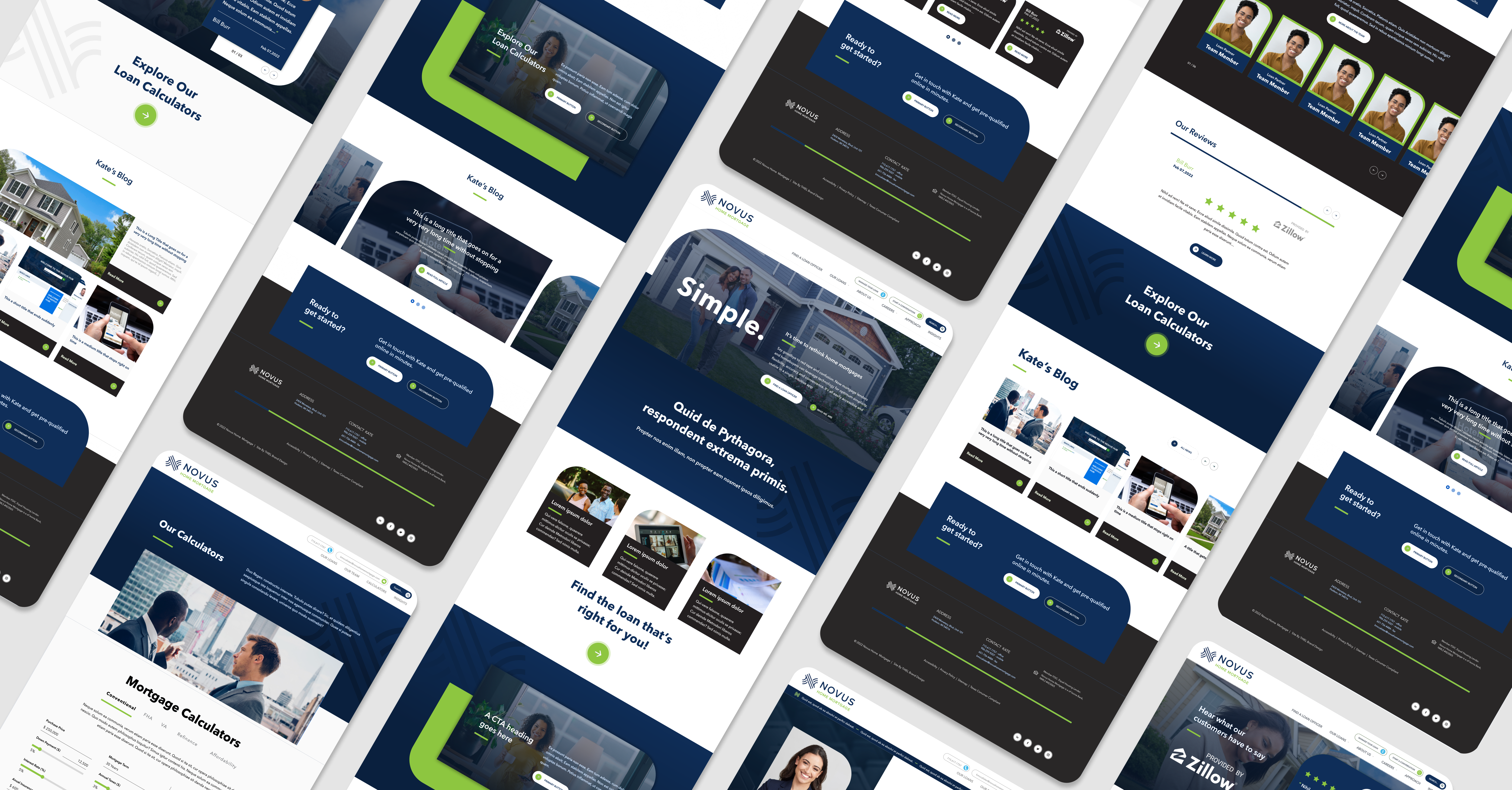
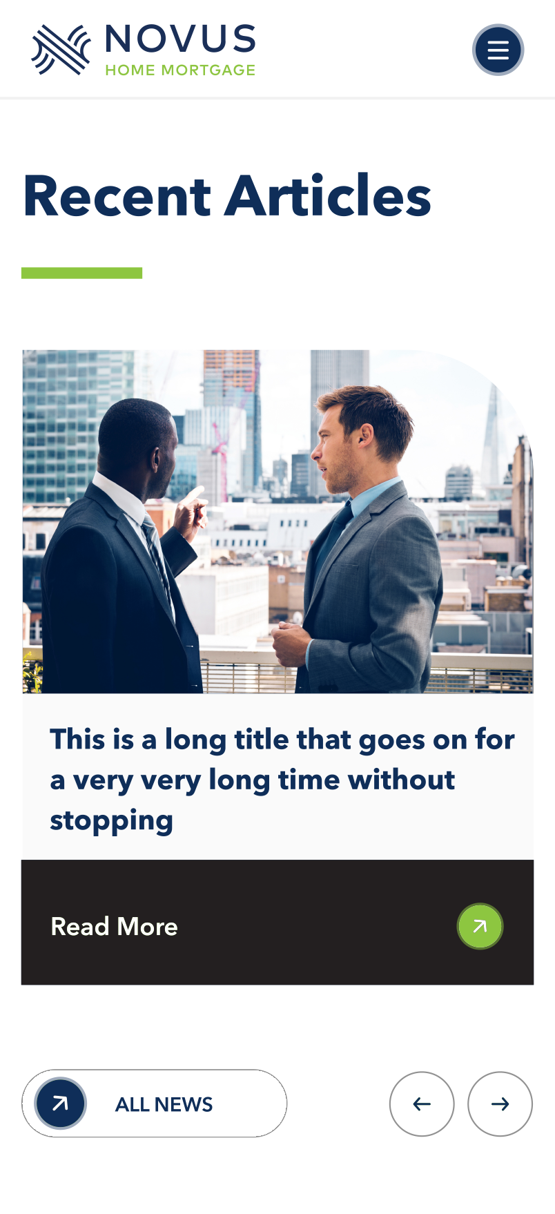
Custom templates were crafted to fulfill the requirements of key focus areas or functions, giving rise to unique pages such as the "Homepage," "Find a Loan For You," and the "Loan Officer Search." In addition to these specialized templates, a collection of modular content section blocks was developed to seamlessly integrate with the custom page builder.
This empowered the Novus marketing team to construct distinctive page layouts effortlessly, utilizing a user-friendly drag-and-drop interface via the CMS backend. These modules were meticulously designed and developed as complementary elements, aligning with the site's design system and maintaining the distinctive look and feel of the Novus brand.

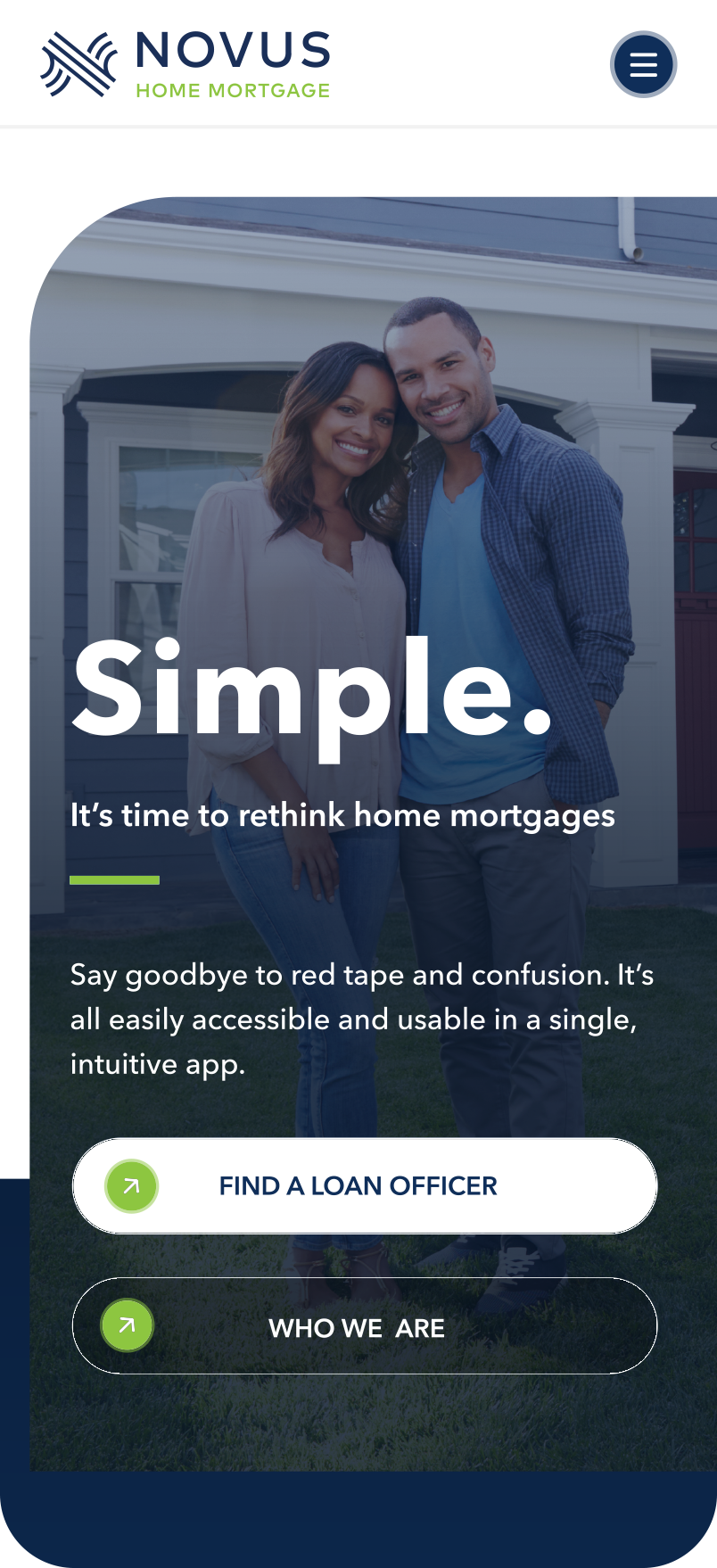

Novus's objective to establish the most seamless and accessible mortgage lending experience served as a key driving force in this site redesign. Adopting a "Mobile First" mindset from the outset was crucial, ensuring that all layouts were designed to seamlessly respond to the dimensions of the viewing device or adapt accordingly through breakpoint styles specified in the desktop, tablet, and mobile design compositions.