At the outset of the website redesign, I devised a Site Map to establish the foundational information architecture. Starting with primary, secondary, and footer navigation, I then delineated the hierarchical page structure, from top-level pages like the Homepage down to third-level templates. This meticulous process yielded 15 templates, facilitating a cohesive user journey.
Sheboygan Paint Co.
Role
-- Design
- Info Arch
- Prototyping
- Strategy
- UI /UX Design
AGENCY - THIEL Brand Design
Sheboygan Paint Co., an industrial paint manufacturer, chose THIEL for a comprehensive digital overhaul, aiming to modernize their brand identity online. My role spanned Strategy, UI/UX Design, Wireframes, and Prototyping, prioritizing responsiveness and practicality. The goal: seamlessly integrate new brand aesthetics into a contemporary web experience, aligning with Sheboygan Paint Co.'s vision for a modern, user-centric platform.
Laying Down
The Foundations.
Using a Low-to-High Fidelity iterative process, wireframes evolved from text-based blocks to refined High Fidelity Interfaces through internal team reviews, collaboration with THIEL Interactive, and feedback from external stakeholders. Specialists on the client side provided valuable insights, refining site navigation, data sheet searching, and developing the "Solutions Finder" tool. This guided users through forms and prompts to connect with the Sheboygan Paint Co. specialist best suited to address their needs.
After moving into the High Fidelity Wireframe phase, prototyping played a pivotal role in testing and refining concepts. Here we were able to test the experience, simulate user journeys and preview functionality of a coded site.
Applying the New
Coat of Paint.
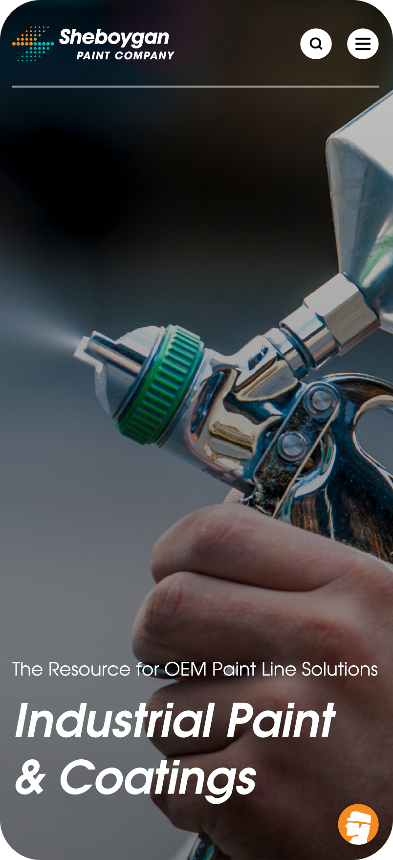
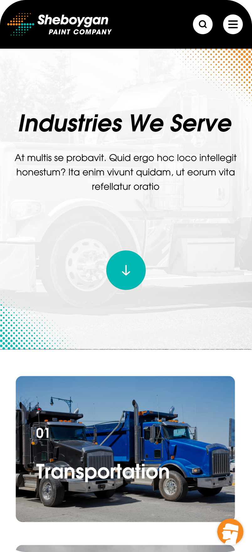
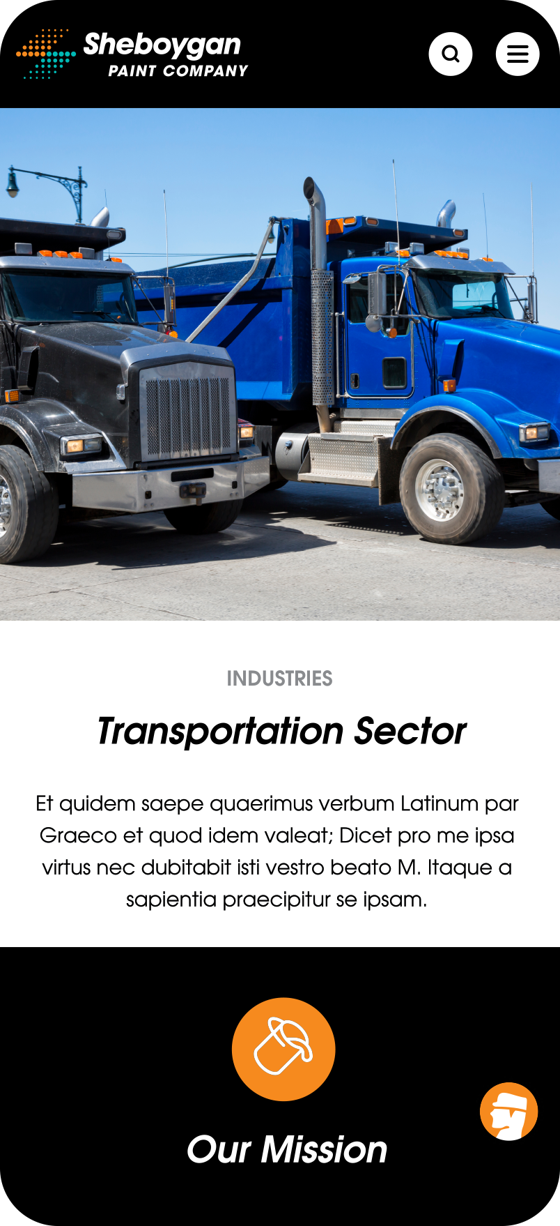
When working with the brand colors, I focused on utilizing the contrast and vibrance of the primary palette. The Brand Design team introduced "Citra" and "Turq," providing ample opportunities to empower and highlight these colors. I deliberately embraced heavy white space, serving a dual purpose: enhancing readability by avoiding content overload for users and allowing the primary colors, though not always present, to make a significant impact when they do, akin to new paint on a blank canvas.
In line with the brand's bold modern aesthetic, the primary typeface "ITC Avant Garde Gothic" was chosen. Its bold nature and variety of weights and styles play a crucial role in shaping the brand's voice. When integrating this typeface into the website, I meticulously structured headings, labels, and body copy. Leveraging the versatility of "ITC Avant Garde Gothic," I utilized the "Demi/Oblique" style and weight for impactful headings, while opting for the "Book/Regular" style weight for easy readability in text-heavy information.
A Fresh New
Digital Experience.
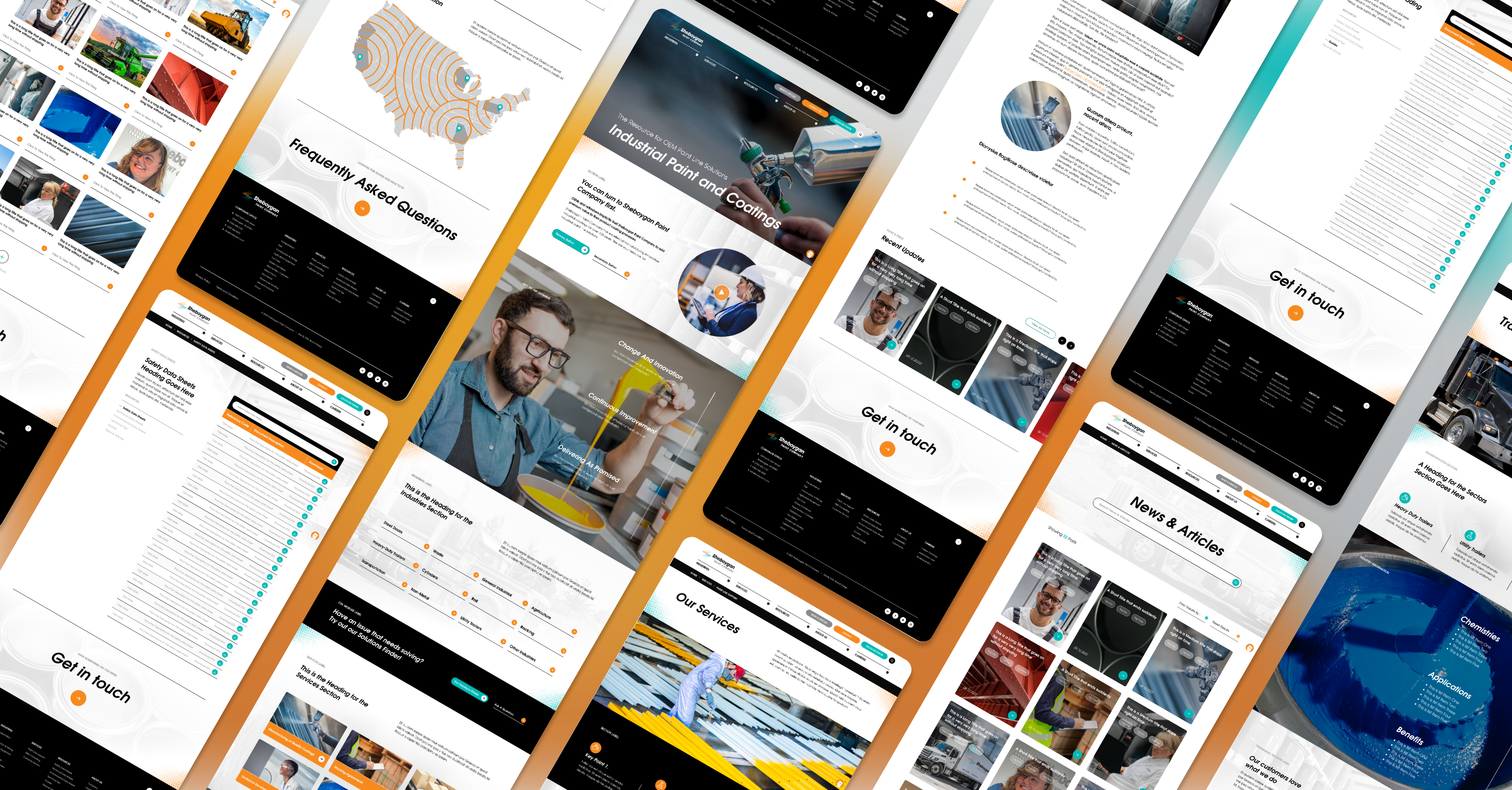
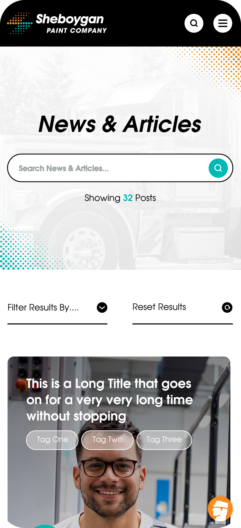
Custom templates adhered meticulously to color and type systems, prioritizing white space and "Micro-Interactions." Details like changing images on link hover and large typography in headings improved navigation and created a memorable user journey. The client's goal of independently creating post-launch pages was addressed with modular layout blocks designed for a user-friendly "drag and drop" system in the CMS. These custom-developed content modules align with the brand for consistent, beautiful results.
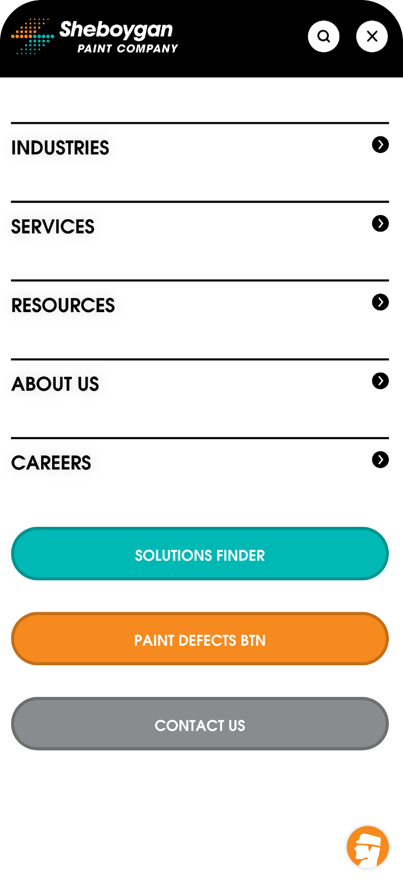

Throughout the design process, a major focus remained on flexibility and responsiveness. Extensive testing was conducted on mobile breakpoints, seamlessly transitioning between responsive flexbox-based sections and adaptive mobile-specific interactions when needed. Ensuring a consistent premium experience across desktop, tablet, and mobile devices was a fundamental goal from the project's inception.
Support Access
On Every Page
Sheboygan Paint Co. prioritized ensuring customer support accessibility on every page. Initially, the client suggested placing a support form at the bottom of each page. However, this approach posed visibility challenges. The solution? Integration of a Chat Tool for constant user accessibility.
Implementing an "Always On" Chat Tool presents both benefits and challenges. While it ensures continuous user-company communication, automated bots often lack personalization. Sheboygan Paint Co.'s dedication to personalized customer solutions, or "Customerization," guided the selection of the "Live Chat" platform. This choice provided real-time human interaction during business hours and automated responses for after-hours inquiries. Additionally, the platform allowed for custom branding, enabling the incorporation of the company's mascot, "STU." To reinforce our brand messaging, we later named the chat tool "Ask STU."
Connect Customers
to Custom Solutions
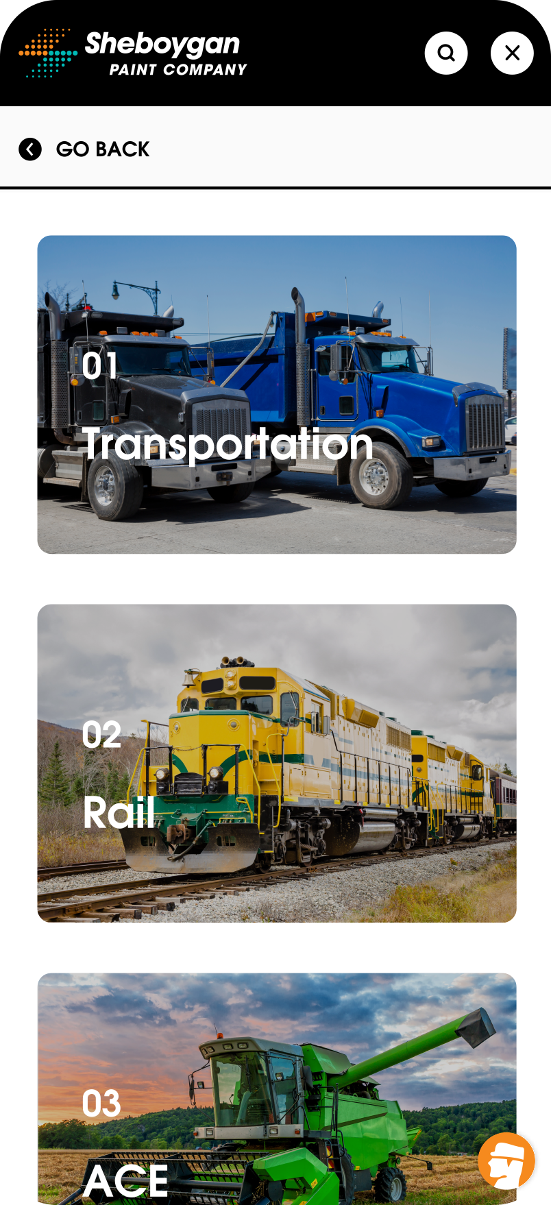
Sheboygan Paint Co.’s dedication to “Customerization” led to the creation of the “Solutions Finder” tool. This tool guides customers through questions to compile industry-specific paint requirements. Partnering with the Director of Business Development, I crafted the tool's User Flow and collaborated with THIEL’s development team for refinement before entering the development phase.
I created wireframe prototypes, ranging from low to high fidelity, to explore UX solutions for the 'Solutions Finder' interface. After testing, we opted for a wizard modal accessible in the primary navigation. This consisted of 4 steps directing customers to tailored business representatives based on their needs.
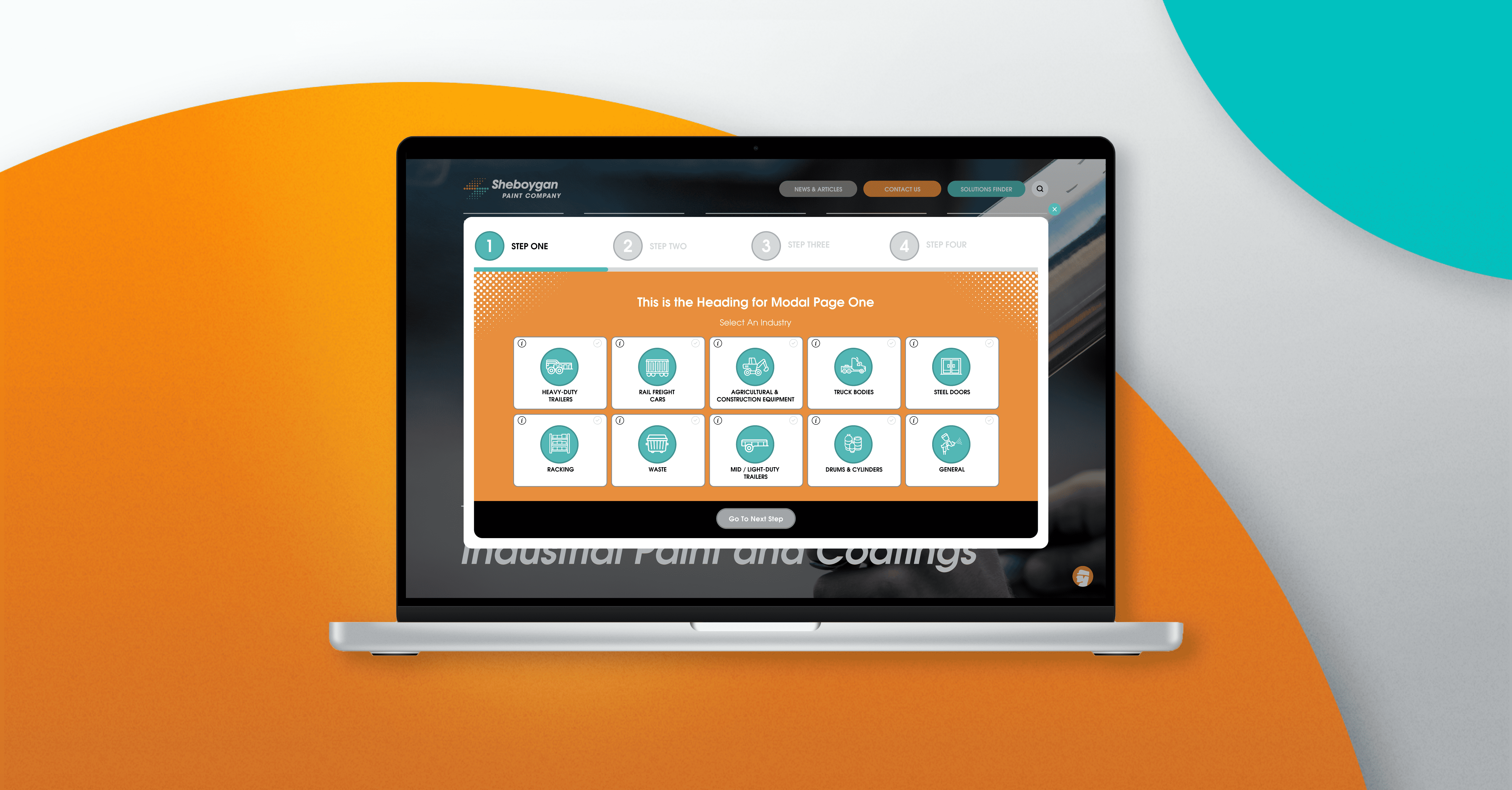
To maintain brand consistency, the iconography from Sheboygan Paint Co.'s packaging, tailored to specific industries, was incorporated into the "Solutions Finder. Additionally, brand colors and typography were used to convey a unique and friendly look and feel to the tool. We also integrated new form inputs into the existing website design system.